In his 2003 novel Pattern Recognition, William Gibson created a character named Cayce Pollard with an unusual psychosomatic affliction: She was allergic to brands. Even the logos on clothing were enough to make her skin crawl, but her worst reactions were triggered by the Michelin Tire mascot, Bibendum.
Although it’s mildly satirical, I can relate to this condition, since I have a similar visceral reaction to word clouds, especially those produced as data visualization for stories.
 If you are fortunate enough to have no idea what a word cloud is, here is some background. A word cloud represents word usage in a document by resizing individual words in said document proportionally to how frequently they are used, and then jumbling them into some vaguely artistic arrangement. This technique first originated online in the 1990s as tag clouds (famously described as “the mullets of the Internet“), which were used to display the popularity of keywords in bookmarks.
More recently, a site named Wordle has made it radically simpler to generate such word clouds, ensuring their accelerated use as filler visualization, much to my personal pain.
So what’s so wrong with word clouds, anyway? To understand that, it helps to understand the principles we strive for in data journalism. At The New York Times, we strongly believe that visualization is reporting, with many of the same elements that would make a traditional story effective: a narrative that pares away extraneous information to find a story in the data; context to help the reader understand the basics of the subject; interviewing the data to find its flaws and be sure of our conclusions. Prettiness is a bonus; if it obliterates the ability to read the story of the visualization, it’s not worth adding some wild new visualization style or strange interface.
Of course, word clouds throw all these principles out the window. Here’s an example to illustrate. About six months ago, I had the privilege of giving a talk about how we visualized civilian deaths in the WikiLeaks War Logs at a meeting of the New York City Hacks/Hackers. I wanted my talk to be more than “look what I did!” but also to touch on some key principles of good data journalism. What better way to illustrate these principles than with a foil, a Goofus to my Gallant?
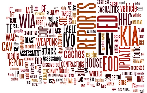
And I found one: the word cloud. Please compare these two visualizations — derived from the same data set — and the differences should be apparent:
I’m sorry to harp on Fast Company in particular here, since I’ve seen this pattern across many news organizations: reporters sidestepping their limited knowledge of the subject material by peering for patterns in a word cloud — like reading tea leaves at the bottom of a cup. What you’re left with is a shoddy visualization that fails all the principles I hold dear.
Every time I see a word cloud presented as insight, I die a little inside.
For starters, word clouds support only the crudest sorts of textual analysis, much like figuring out a protein by getting a count only of its amino acids. This can be wildly misleading; I created a word cloud of Tea Party feelings about Obama, and the two largest words were implausibly “like” and “policy,” mainly because the importuned word “don’t” was automatically excluded. (Fair enough: Such stopwords would otherwise dominate the word clouds.) A phrase or thematic analysis would reach more accurate conclusions. When looking at the word cloud of the War Logs, does the equal sizing of the words “car” and “blast” indicate a large number of reports about car bombs or just many reports about cars or explosions? How do I compare the relative frequency of lesser-used words? Also, doesn’t focusing on the occurrence of specific words instead of concepts or themes miss the fact that different reports about truck bombs might be use the words “truck,” “vehicle,” or even “bongo” (since the Kia Bongo is very popular in Iraq)?
Of course, the biggest problem with word clouds is that they are often applied to situations where textual analysis is not appropriate. One could argue that word clouds make sense when the point is to specifically analyze word usage (though I’d still suggest alternatives), but it’s ludicrous to make sense of a complex topic like the Iraq War by looking only at the words used to describe the events. Don’t confuse signifiers with what they signify.
And what about the readers? Word clouds leave them to figure out the context of the data by themselves. How is the reader to know from this word cloud that LN is a “Local National” or COP is “Combat Outpost” (and not a police officer)? Most interesting data requires some form of translation or explanation to bring the reader quickly up to speed, word clouds provide nothing in that regard.
Visualization is reporting, with many of the same elements that would make a traditional story effective.
Furthermore, where is the narrative? For our visualization, we chose to focus on one narrative out of the many within the Iraq War Logs, and we displayed the data to make that clear. Word clouds, on the other hand, require the reader to squint at them like stereograms until a narrative pops into place. In this case, you can figure out that the Iraq occupation involved a lot of IEDs and explosions. Which is likely news to nobody.
As an example of how this might lead the reader astray, we initially thought we saw surprising and dramatic rise in sectarian violence after the Surge, because of the word “sect” was appearing in many more reports. We soon figured out that what we were seeing had less to do with violence levels and more to do with bureaucracy: the adoption of new Army requirements requiring the reporting of the sect of detainees. Of course, the horrific violence we visualized in Baghdad was sectarian, but this was not something indicated in the text of the reports at the time. If we had visualized the violence in Baghdad as a series of word clouds for each year, we might have thought that the violence was not sectarian at all.
In conclusion: Every time I see a word cloud presented as insight, I die a little inside. Hopefully, by now, you can understand why. But if you are still sadistically inclined enough to make a word cloud of this piece, don’t worry. I’ve got you covered.
This is an insightful and rather shrewd criticism of word clouds, and I think it applies to much of the infographic, data-visualizaion obsessed tech culture we live in.
I find myself fascinated by many of the new and innovative ways to graphically represent data. Yet, as Jacob Harris points out, many of these sleek new techniques (if they don't miss the point entirely) strip supposedly core ideas from the very context that lend them meaning... and we are left with a aesthetically pleasing series of pretty graphs and pie charts that convey very little actual information (see my post on the Infographic Idiom).
And even though CNN, Fox and other news networks are now embracing new visualization tools, tag clouds are ultimately useless measures of political sentiment, because concepts themselves really cannot be reduced to their most elemental articulation; in a word.


