
via flowtown.com
via nytimes.com
via diametunim.com

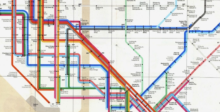
Alexander Chen used HTML5 and Massimo Vignelli's famous subway map to turn NYC's mass transit system into a playable musical instrument.Manhattan denizens sometimes describe the sounds of the subway as the city's incidental music. Now programmer/designer Alexander Chen has created a more soothing version with MTA.me, an interactive NYC subway map-turned-musical-instrument that uses transit lines as its strings.
Chen, who works at Google Creative Lab, used HTML5 to code MTA.me's behavior: not only do crossing train lines "pluck" each other's strings, you can do the same thing with your mouse. And as for the map itself, Chen chose the classic/infamous Massimo Vignelli design as his template.
A detail from Vignelli's 1972 NYC subway map.
The choice makes sense: the "strings" in Chen's instrument need to be taut and straight, and Vignelli's ruthlessly rectilinear design (inspired by the London Tube map, which was itself inspired by electrical engineering diagrams) provides the necessary visual tension for "plucking."
But MTA.me isn't just design-homage in a vacuum: using the real MTA's public API, Chen's creation polls real-time train departures and arrivals to spawn its animation. The map then accelerates through a 24-hour loop of subway activity, generating music with just enough randomness to be interesting but not distracting. The effect is not unlike that of Pulsate, another browser-based musical interactive piece we raved about.
Other subtle-but-delightful design touches: the length of the train line dynamically determines its pitch when plucked, and the white background fades to black as the 24-hour train cycle makes its way from day to night. Chen even added historical easter eggs for eagle-eyed transit buffs: "The 8 train, or the Third Ave El, was shut down in 1973. The former K train was merged into other routes. I decided to run these ghost trains between 12am-2am," he says in his blog.
As an interactive portrait-in-code of the most famous mass transit system in the world, MTA.me excels. And it's a helluva lot more pleasant to listen to than the screeching sounds of the 4 train at Union Square.
via fastcodesign.com
Wow, this is cool! I am already a bit of a data-visualization geek, and Linkedin's new lab allows you to explore the interconnectivity within your own Linkedin contacts, which is amazing. I mapped my personal connections below, and each color roughly corresponds to an industry, an association or social grouping (like college) to which I might belong. Zoom in and you begin to see affiliations among your various relationships.


via youtube.com
via npr.org