City vs. Suburban Walking

Since I moved to New York City about six years ago, I've always felt I've walked more than I did in a small town Indiana college.  Even growing up in the rural Pennsylvania, where I tread daily on a half mile walk to and from the school bus each morning, doesn't compare with my daily perambulation in the city. 

And here is why:  The sheer volume of businesses and services available in a city within walking distance dwarves the accessibility of the suburbs. The urban consumer is much more likely to walk to work or the grocery store, because it's so much closer to home.  Suburban commuters are inclined to drive, because they need a vehicle to get most places they want to go.

I think anyone in an urban area understands this implicitly, but the team at the Sightline Institute has illustrated this by actually graphing the area in which a commuter can cover in a mile's walk. A mile simply takes a person further in the city, based on the geometry of urban planning, whereas a suburban stroll leaves you navigating neighborhood cul de sacs and side roads. 

Both the density and proximity of desirable destinations make a city a more effective place to walk, and urban residents simply walk... more.


Radial Cartography of New York City

Here are a several amazing infographics of NYC, reflecting the building height in relation to land value, and mapping Manhattan's development index, according to price per square foot and zoning regulations in relation to property values.  This come from a fantastic data visualization blog, with quite a few fascinating cartographic representations.

Two Dimensional representation of (3 dimensional) building heights.

BUILDING HEIGHTS 
Bill Rankin, 2006

Manhattan's land value represented by color density.  Similar to building height above, the highest valued land is clustered around midtown and NYC's Financial District / Battery Park City.


LAND VALUE 
Bill Rankin, 2006

"Tax assessments are a tricky data source, since they do not measure market value — indeed, there are even tax-assessed "values" on public buildings and parks. (Here Central Park is "valued" at $1.9 billion.) But they do give a rough sense of relative values within the city: the pocket of wealth up near the cloisters, and the relative sparseness of the lower east side.

Note: even though this map shows building footprints, the land value shown for each building is per square foot of lot size."


UNDERDEVELOPMENT 1:

a theoretical market 
Bill Rankin, 2006

In a hypothetical "perfect market," this map would be a consistent yellow-green. Every lot would be built up precisely in accord with its land value. Lots which were underdeveloped would be torn down and built up again with higher densities. Overdeveloped sites would lower the price of nearby lots, again establishing equillibrium. But government distorts the market (often in very good ways), by building low-density public buildings and monuments in central areas (e.g., the Public Library or Lincoln Center), or building public housing that the market would not otherwise provide (see the lower east side). Zoning also restricts development for the sake of light, air, and congestion.

Notice the difference between Midtown and Wall St.: Downtown looks very close to a "perfect market," while Midtown seems restrained by zoning. Notice also underdevelopment along Madison Ave. and Broadway, and the (thankfully) "irrational" presence of churches throughout the city.

Note: See also methodological notes about tax-assessment data on the Land Value map.


UNDERDEVELOPMENT 2:
relation to zoning
Bill Rankin, 2006

In response to my original map of "underdevelopment" in Manhattan, urban planner Josh Jackson emailed me from New York with some ideas for a map which would show development in relation to FAR. This is my attempt at such a map. Thanks to Josh for helping me with these ideas; our email exchange is below.


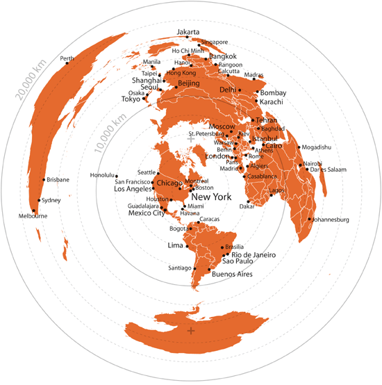
New York is the Center of the World

From Radial Cartography

MTA Transit Calculator: Travel Time Heatmap for any Subway in NYC by WNYC

WNYC just created a fantastic transit calculator map for travel time from borough to neighborhood to zipcode in New York City. Just type in a desired address, and you can see average travel times to anywhere in the five boroughs. This is my average travel-time living on East Broadway on the Lower East Side.  The red colors indicate a less than ten minute commute, ranging from purple showing over and hour and a half travel time. 

via WNYC.org


This is a great tool if you're looking for a new apartment in a new neighborhood, but aren't sure about how long you'll spend in transit during your work commute.  

Annual Electric Usage By Block for New York City

The map represents the total annual building energy consumption at the block level (zoom levels 11-15) and at the taxlot level (zoom levels 16-18) for New York City, and is expressed in kilowatt hours (k Wh) per square meter of land area. The data comes from a mathematical model based on statistics, not private information from utilities, to estimate the annual energy consumption values of buildings throughout the five boroughs. To see the break down of the type of energy being used, for which purpose and in what quantity, hover over or click on a block or taxlot.

 -via columbia.edu